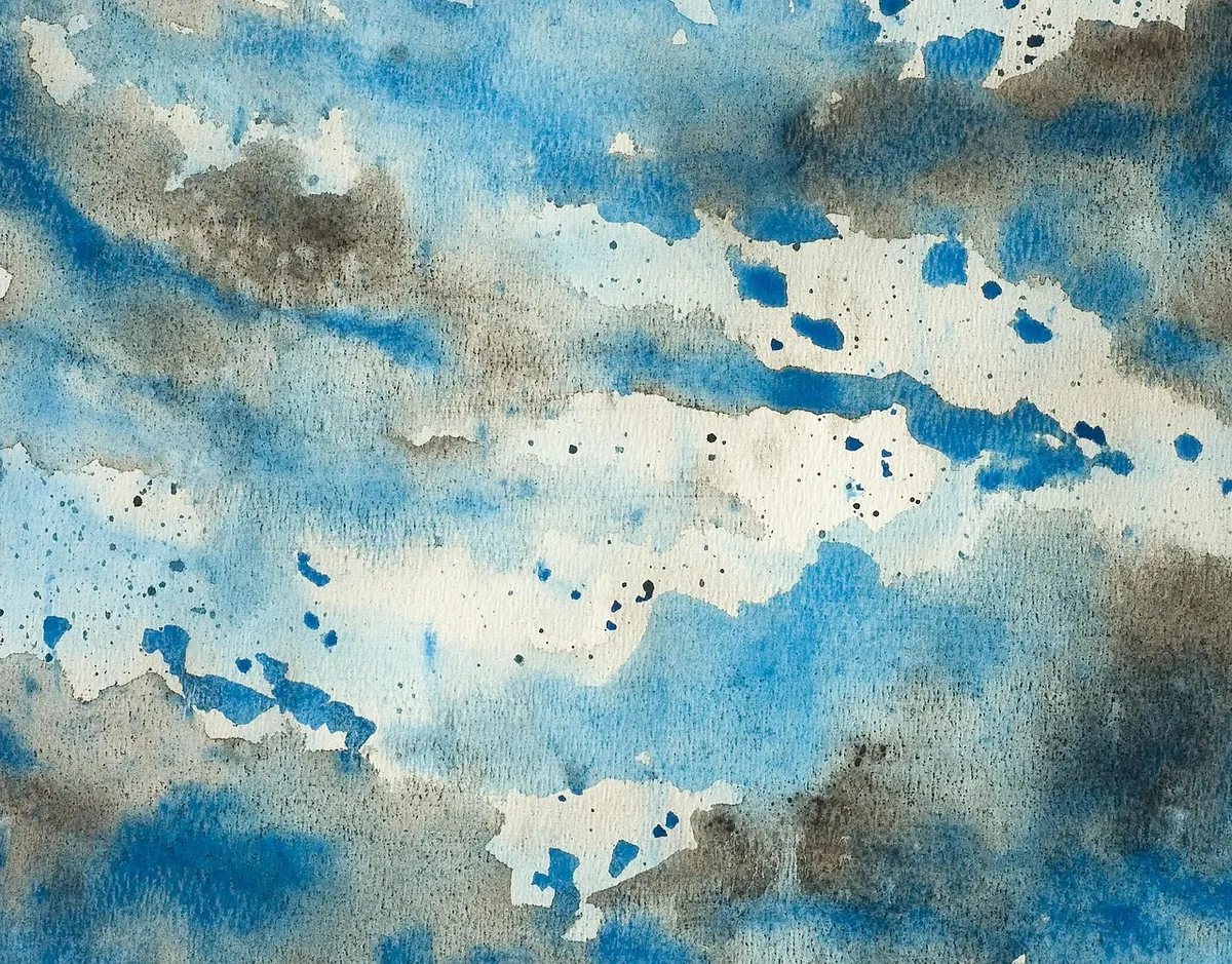
Watercolour Washes Explained: Flat, Graded and Variegated
Every watercolour painting you admire, from a soft evening sky to a crisp roofline, is built on washes. Get them right and the rest of the picture has something solid to sit on. Get them wrong and you will spend the afternoon chasing tide marks across soggy paper. Washes are mechanical skills rather than mysterious talents, and they come down to three things you can control: how much water is in your mix, how much water is in your brush, and how wet the paper is when the paint arrives.
What a wash actually is
A wash is a film of pigment held in water, laid onto paper and then left alone. That last part matters more than anything. Watercolour dries by evaporation, so pigment settles exactly where the water leaves it. Keep brushing after the surface has begun to dull and you lift colour, leaving streaks. Drop fresh wet paint into a half-dry wash and you get a hard, cauliflower-shaped edge that no amount of scrubbing will remove.
Three variables shape the result:
- Pigment load — how much colour sits in your puddle.
- Water volume — how much liquid ends up on the paper.
- Paper wetness — whether the sheet is dry, damp or soaked.
Mixing water and pigment
Mix more paint than you think you need. Washes fail far more often because the brush ran dry halfway across than because the colour was wrong. Use a large round or a mop, mix in a well or saucer rather than on the paper, and draw pigment from the edge of the pan instead of scrubbing at it with a wet brush.
Aim for the consistency of semi-skimmed milk. The brush should drip slowly when lifted, not pour. A tea-thin mix gives a weak wash that blotches; a cream-thick mix sits on the surface, dries shiny and can crack. Test on a scrap of the same paper: if the stroke spreads evenly and dries flat, you are ready. If the edges snap back sharply, add water. If it looks starved and scratchy, add pigment.
The flat wash
A flat wash is one even tone with no variation from top to bottom. It is the trickiest of the three to do well and the one worth practising most. Skies, walls, distant water and backgrounds all begin here.
- Mix a generous puddle of a single colour and check its strength on scrap paper.
- Tilt the board about 10 to 15 degrees so the paint runs downwards and gravity works with you.
- Load the brush fully, touch it to the top-left corner and pull one horizontal stroke across to the right.
- Reload and lay the next stroke immediately below, overlapping the bottom edge of the first. Work quickly, before any of it starts to dry.
- Carry on to the bottom, then wipe or squeeze the brush and pick up the bead of paint that has collected along the final stroke.
- Leave it flat to dry. Don't go back in, however tempting that pale patch looks.
Overlap is where beginners lose the wash. Strokes have to join while the paper is still shiny. If you can see a boundary line, you are either moving too slowly or your brush is too dry.
The graded wash
A graded wash moves from dark to light, or the reverse, across the sheet. It is the standard treatment for skies and the most useful gradient to have in your hand.
Start with your strongest mix and lay the first stroke as above. Add a little clean water to the puddle before the second stroke, a little more before the third, and keep going. Each stroke gets progressively weaker. Keep the strokes touching and the rhythm steady. If a faint step shows, a light pass with a barely damp brush will blend it — but only while the surface is still wet.
For the reverse, begin weak and add pigment as you travel down the page. This version suits hills, foregrounds and anything that should grow heavier towards the viewer. Mix the whole sequence in the same puddle so the hue stays constant; only the concentration changes.
The variegated wash
A variegated wash uses two or more colours that merge on the paper. It is the loosest of the three and the most forgiving.
Load one brush with each colour. Lay the first across the top, then lay the second directly beneath it so the wet edges touch and bleed. Tilt the board and let them find each other. A third colour along the bottom is fine, but stop there — three is plenty, and every extra touch increases the risk of mud.
Colours that sit near each other on the wheel behave best: yellow into orange into red, or cerulean into violet. Opposites mix into a neutral grey-brown where they meet, which is lovely in small doses and dreary across a whole sheet. If you want cleaner separation, leave a hair's breadth of dry paper between the two strokes and let the colour bleed into the gap.
Drying times and paper choices
Drying depends on room temperature, humidity, paper weight and how much water you left behind. In a warm room, a thin wash on stretched paper is usually touch-dry in five to ten minutes and fully dry within twenty; a soaked sheet can take an hour or more. Test with the back of your hand rather than a fingertip — skin oils repel the next wash and leave pale marks.
- 300gsm (140lb) cold-pressed paper is the sensible default. It takes a decent wash without buckling and gives you working time.
- Lighter papers need stretching. Soak, lay flat, tape down and let dry before painting, or the sheet will ripple and pool paint in the hollows.
- Rough paper holds water in its pits, so washes dry more slowly and look slightly broken. Good for texture, awkward for even flat areas.
- Hot-pressed (smooth) paper dries fast and records every stroke. Unforgiving of hesitation, superb for crisp, even washes.
A hairdryer on the cool setting will speed things along, but hold it well back and keep it moving. Heat warps the sheet and can bake a wash into place before you have finished. Slow, natural drying gives cleaner colour.
Practise on one sheet, three strips
Set aside twenty minutes. Divide
Photo: rosiekeystrokes / Pixabay
You Might Also Like
A 30-day drawing challenge using household objects, with a week-by-week list, plus practical tips on observation, line confidence and shading habits.
Artist's block is rarely about missing supplies. Five free drawing exercises — timed studies, blind contours, master copies and more — to get your hand moving again.